


SOF App
A platform that helps students, chapter leaders, and national teams collaborate through structured workflows and operational tools.
Overview
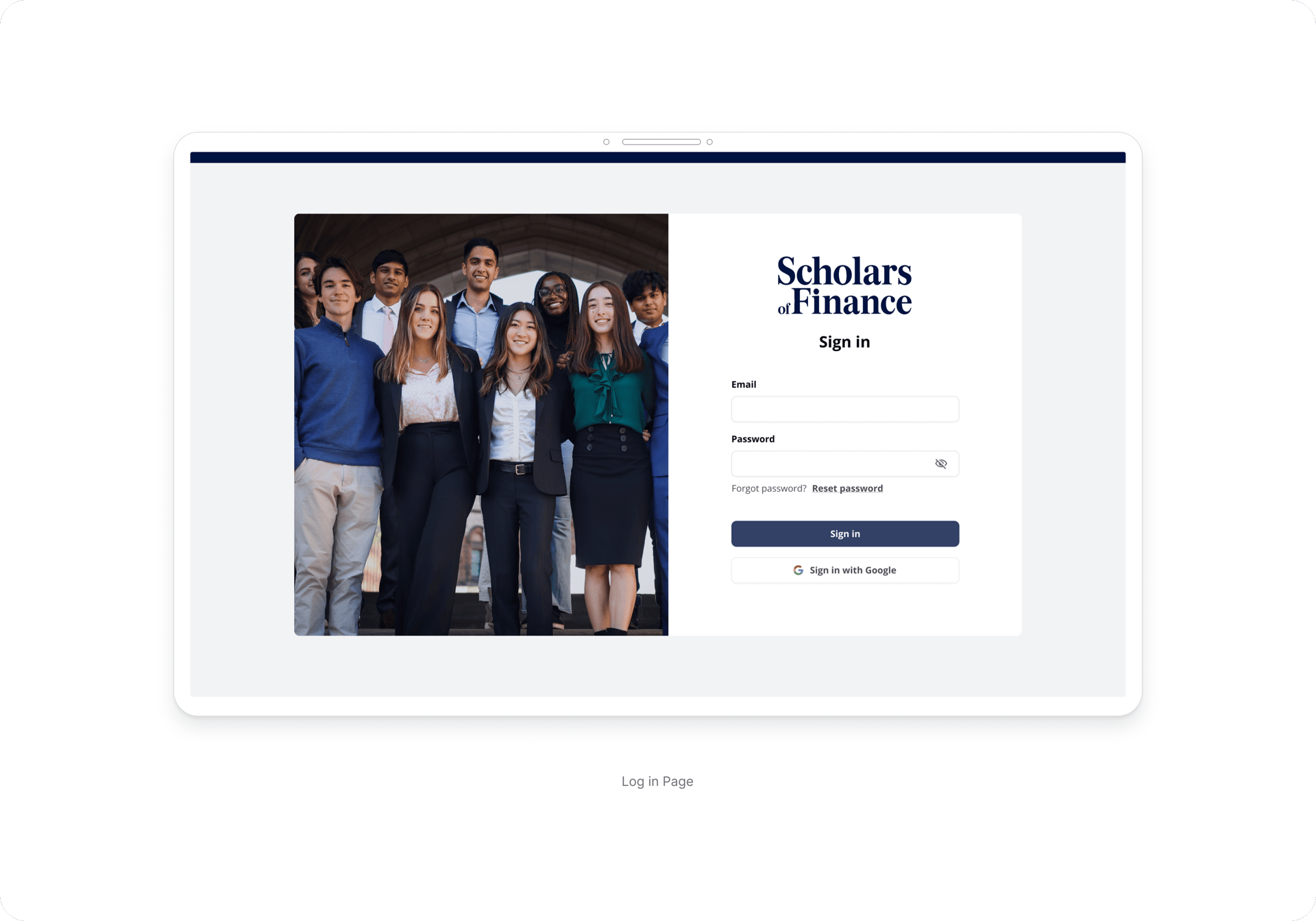
Scholars of Finance is a U.S.-based nonprofit that develops university students into values-driven leaders. The organization relied on a low/no-code platform that limited flexibility, scalability, and control over the user experience.
Role
The existing system lacked structure and clarity, making it difficult for different user roles to navigate workflows and complete key actions. This resulted in friction across recruiting, program management, and day-to-day operations.
Solo Product Designer
Product Strategy, UX/UI Design, Design System, User Research, Prototyping
The Problem
As Scholars of Finance expanded across universities in the U.S., operational complexity increased across recruiting, program management, and chapter coordination.
The organization relied on fragmented tools and a low/no-code platform that limited scalability, visibility, and control over workflows. Different user groups operated with inconsistent experiences, making collaboration and operational efficiency increasingly difficult as the organization grew.
Without a structured system, key processes became difficult to manage, slowing down operations and creating friction across the organization.
Discovery & System Mapping
To understand the operational complexity of the organization, I analyzed the existing low/no-code platform, mapped workflows, and identified the needs of different user groups across the system.
This process helped establish the foundation for a more scalable and structured platform experience.
My discovery process focused on:
• Understanding how recruiting, leadership programs, and chapter operations were managed
• Identifying the permissions and responsibilities of different user roles
• Mapping friction points and inconsistencies across workflows
• Understanding how information was structured and managed within the existing platform
• Aligning with stakeholders on operational needs and product priorities
Validating the Visual Direction
The evaluation focused on:
• Layout clarity and information organization
• Color distribution and visual balance
• Image sizing and placement
• Perception of professionalism and modernity
• Information hierarchy and readability
Option A was selected by 16 out of 26 participants.
Better information prioritization
Greater visual consistency
Clearer structure and navigation
📝
💼
🧭
🧱
A more professional appearance
Users connected clearer hierarchy and structured layouts with professionalism and trust.
Before defining the visual direction of the platform, I conducted an unmoderated preference test using the old home screen, to understand how users perceived different interface approaches in terms of clarity, hierarchy and professionalism.
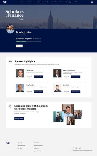
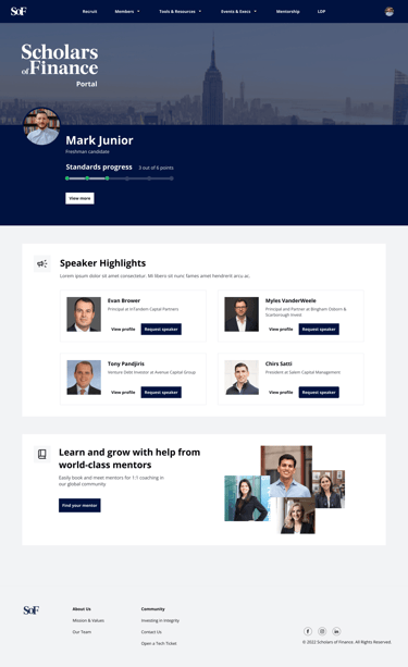
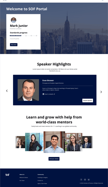
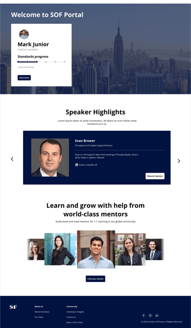
Option A
Option B
Option C
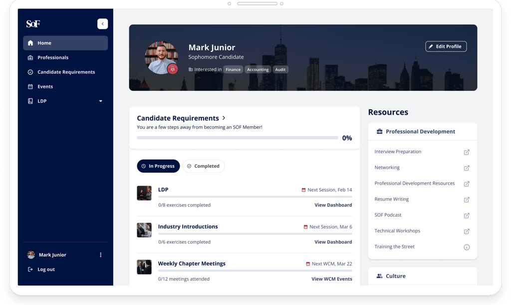
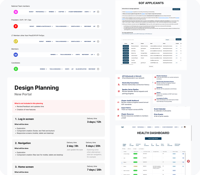
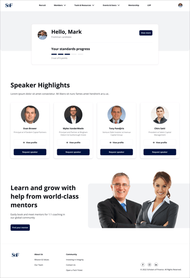
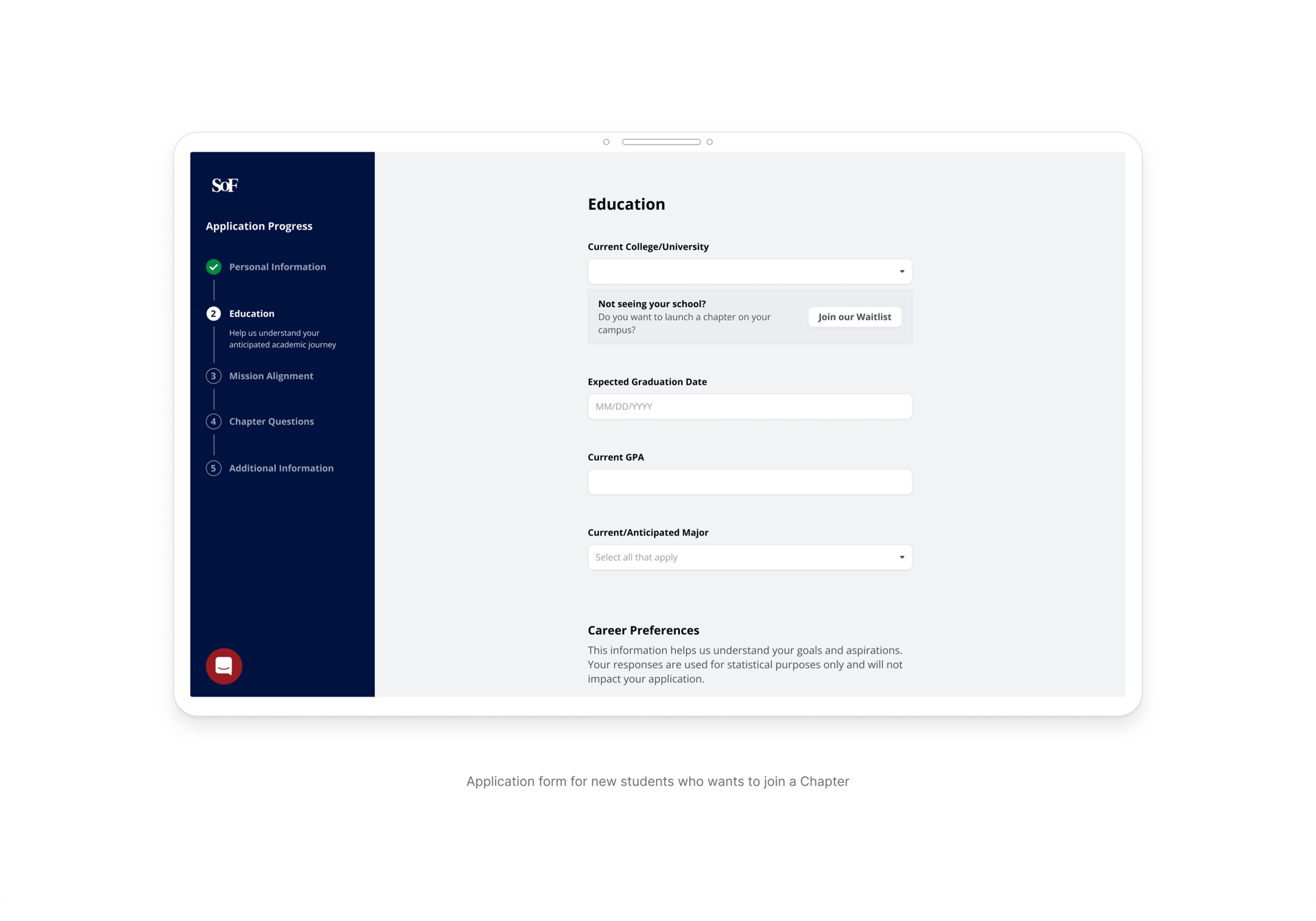
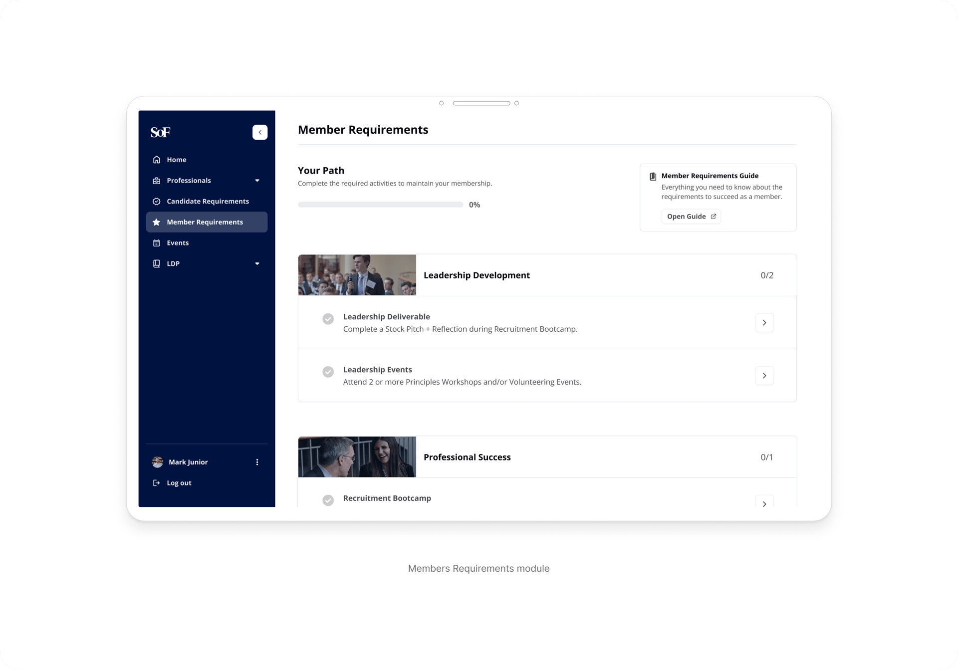
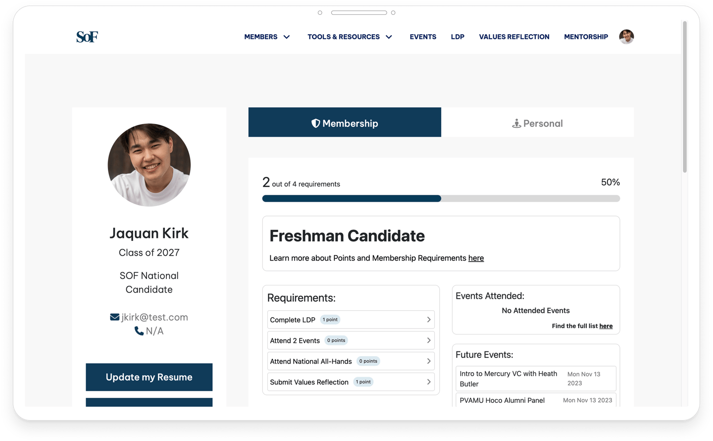
User Roles & Operational Needs
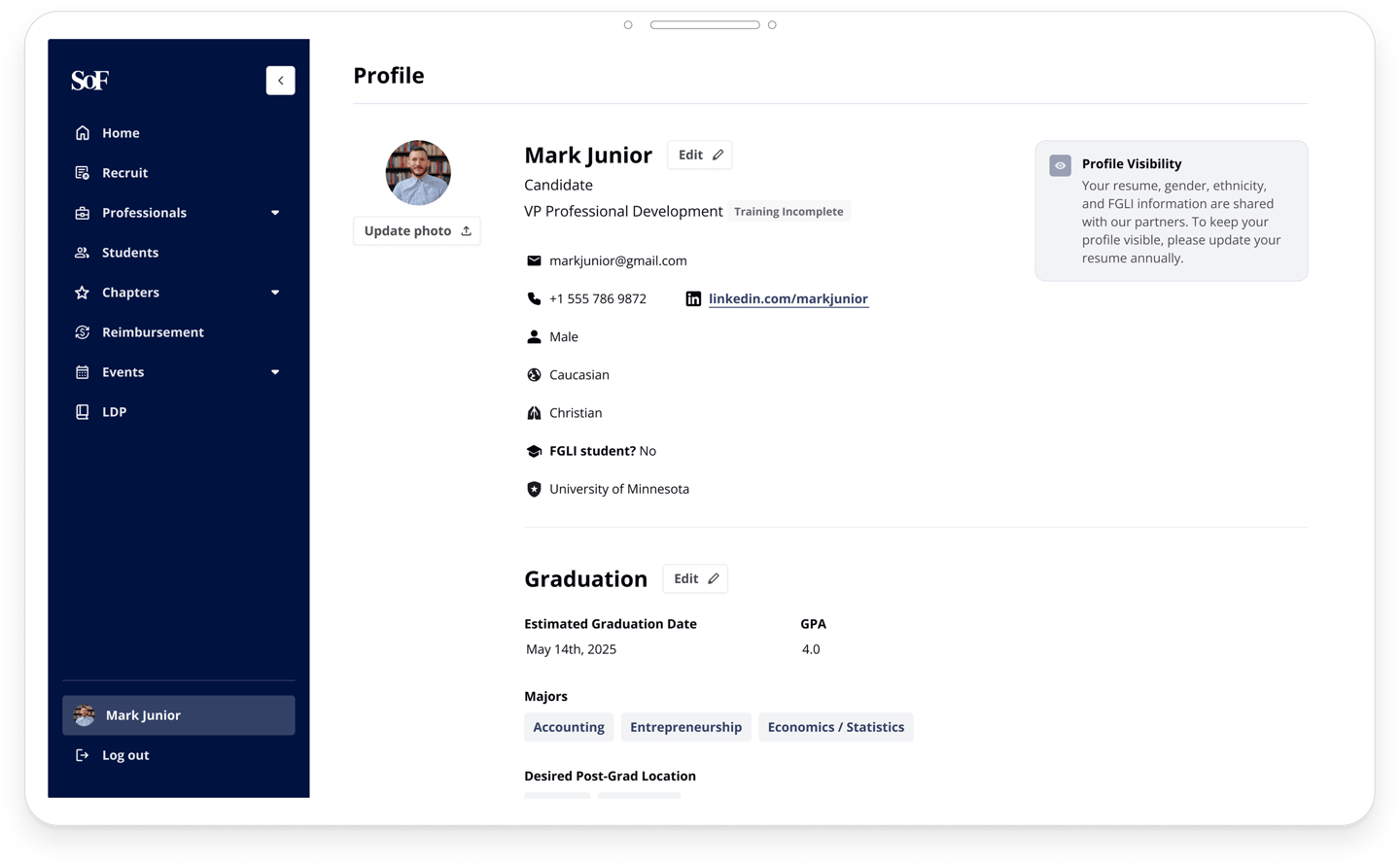
Candidate / Members
Applies to programs, completes requirements, and engages with chapter activities
Main Goals
• Apply to recruiting
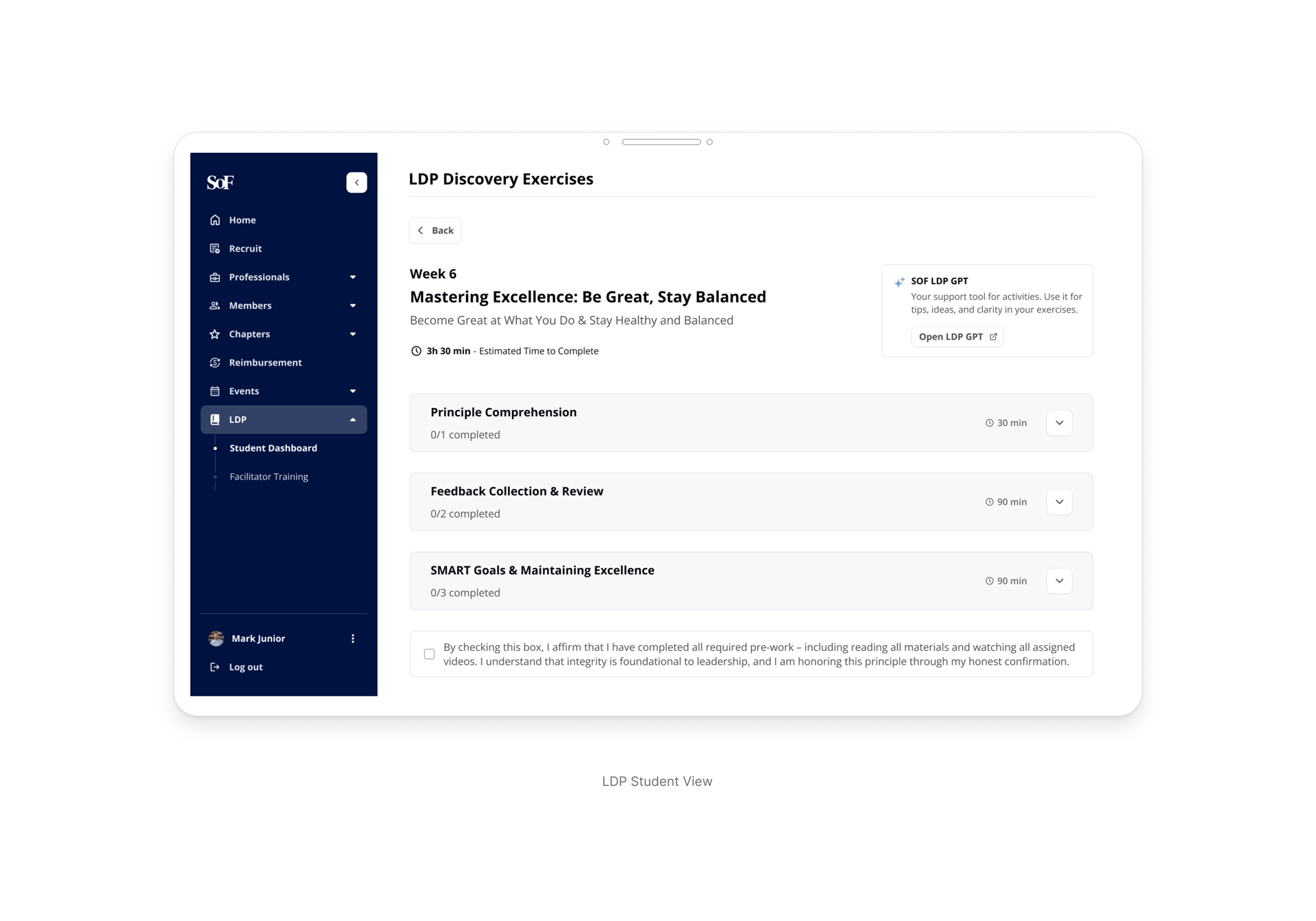
• Track progress and requirements
• Access chapter information and events
• Complete assigned activities and exercises
Key Needs
• Clear progress visibility
• Structured onboarding and recruiting flows
• Easy access to tasks and deadlines
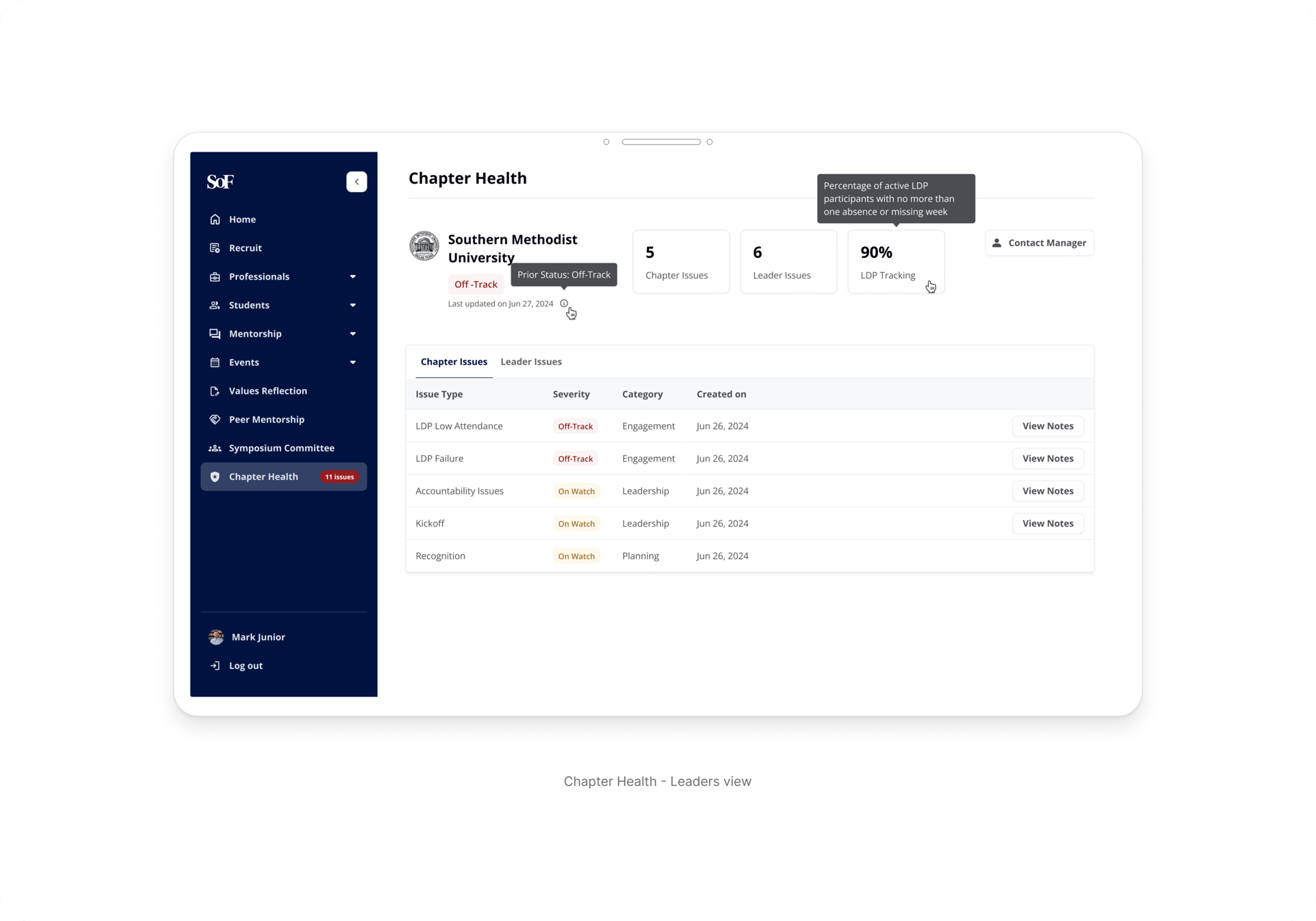
Chapter Leaders
Students responsible for managing recruiting, operations, and member engagement within university chapters.
Main Goals
Key Needs
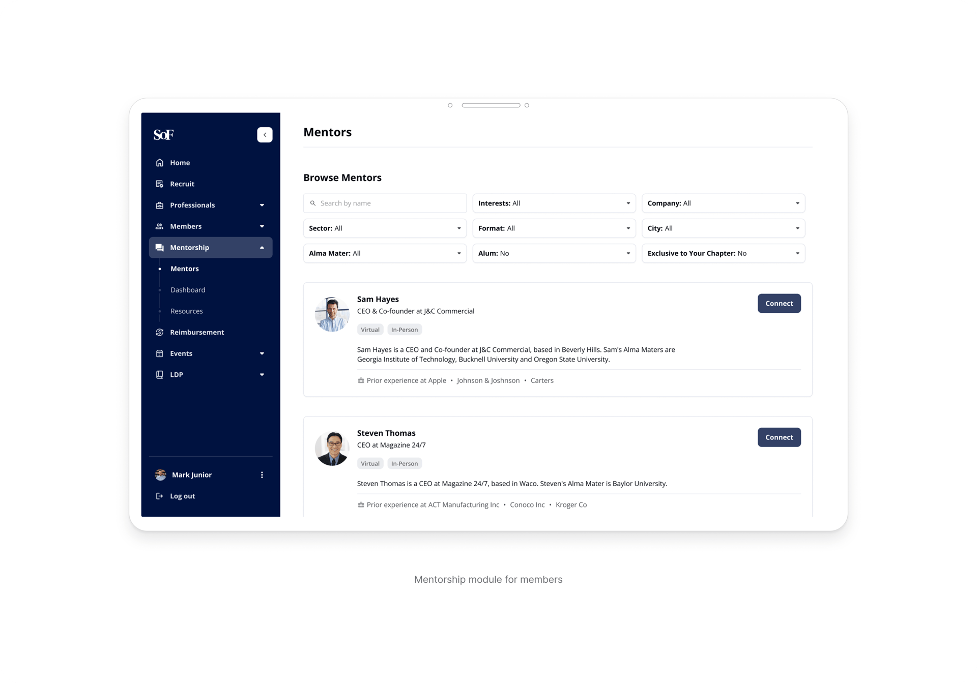
• Manage recruiting pipelines
• Review and organize applicants
• Coordinate chapter activities and events
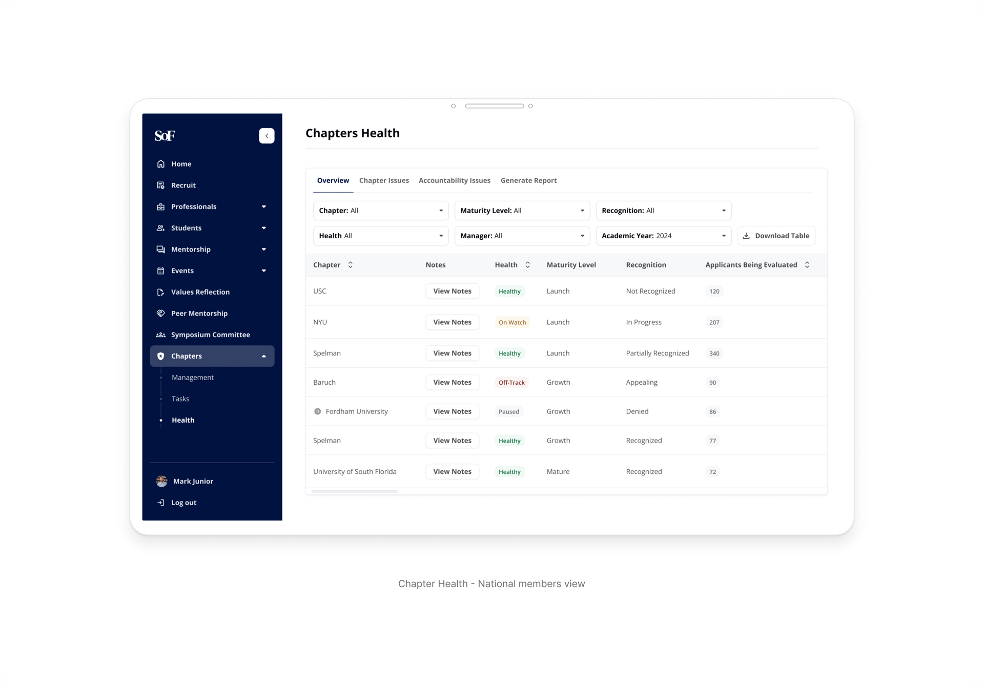
• Track chapter health and operational progress
• Efficient operational workflows
• Visibility across recruiting stages
• Collaboration with members and national teams
SOF National Team
Internal staff responsible for supporting chapters, managing programs, and overseeing operations across the organization.
Main Goals
Key Needs
• Monitor chapter performance and engagement
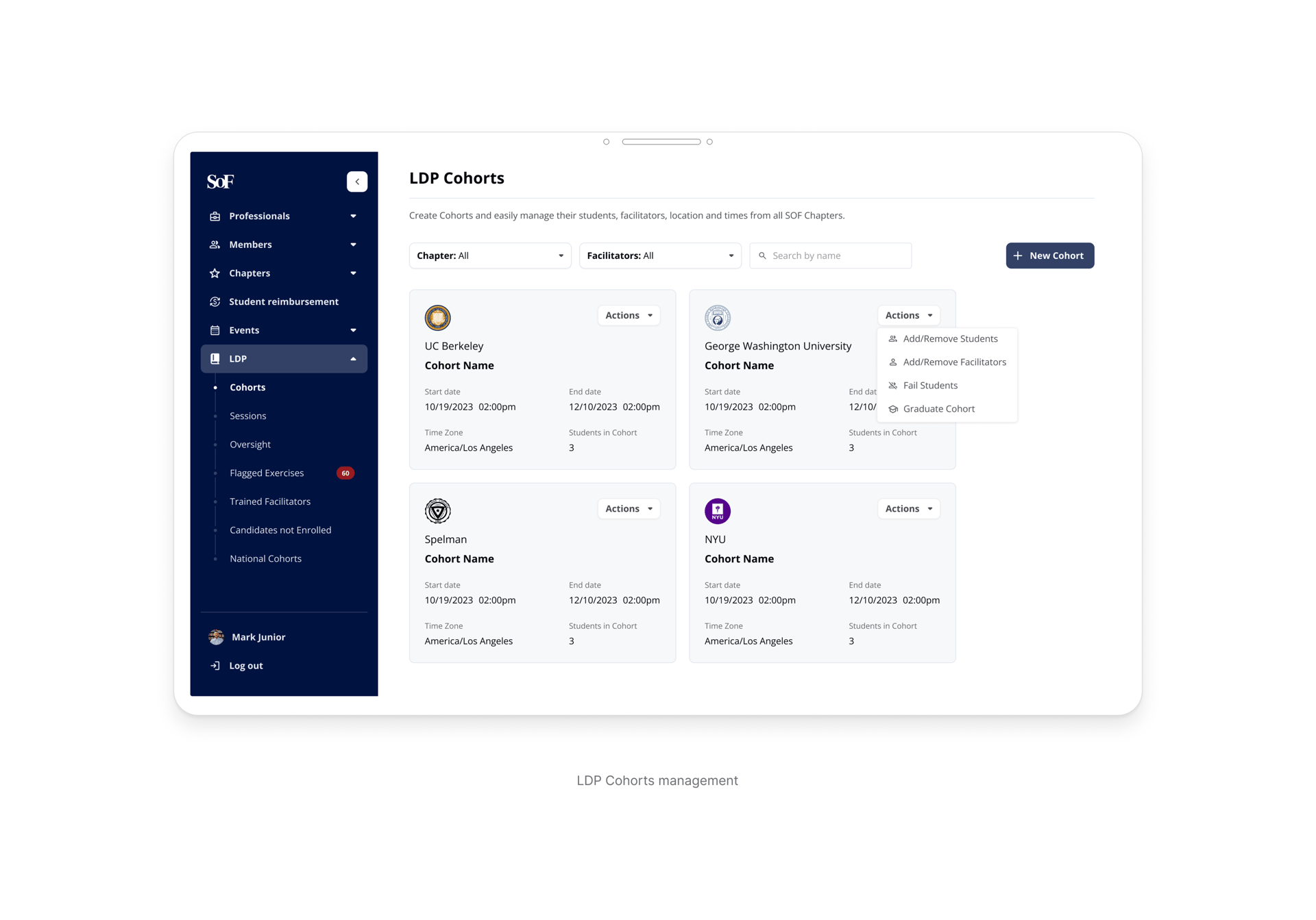
• Manage organization-wide programs
• Maintain operational consistency across chapters
• Access structured reporting and insights
• Scalable administrative tools
• Cross-chapter visibility
• Structured data management and reporting
The platform supported multiple user groups with different permissions, responsibilities, and operational goals. Understanding how each role interacted with the system was essential to designing scalable and efficient workflows.
Designing Under Constraints
The project involved redesigning a large operational platform within a tight delivery timeline. To maintain speed without compromising clarity, I prioritized rapid iteration directly in high-fidelity designs instead of investing heavily in low-fidelity explorations.
This approach allowed stakeholders, engineers, and product leadership to align quickly on workflows, structure, and interaction patterns while development progressed in parallel.
Design decisions were continuously refined through collaboration, feedback loops, and ongoing validation as new modules and operational requirements emerged.
Here Are Some Results
Measuring Impact
“The recruiting process in our Chapter is much better compared to the previous system we used, like the old portal. We have everything planned out and applications are submitted directly through the portal, which streamlined things”
Chapter Leader testimony during a user interview
4,000+
New student applications submitted through the app
After launch, the platform became a central operational layer connecting students, chapter leaders, and the national team across the organization
The project also introduced a continuous discovery mindset within the organization. Through ongoing interviews and product feedback analysis, the team established a more iterative approach to identifying friction points and improving the app over time.
4,5
CSAT score after launch


"The new Chapter Health feature helps make sure we're on track. I think our biggest priority was making sure that we're recognized on campus this semester. I really like it. It's a really nice tool.”
Chapter Leader testimony during a user interview
1. Structure creates clarity
When products support multiple user roles, operational complexity grows quickly. Establishing consistent workflows, hierarchy, and permissions was essential to making the platform scalable and easier to navigate across the organization.
2. Constraints shape the process
With a tight timeline and multiple modules being developed simultaneously, prioritization became critical. Focusing on the highest-impact workflows first allowed the team to move quickly while maintaining consistency across the experience.
3. Perception influences trust
The preference testing process reinforced how strongly users associate visual hierarchy and organization with professionalism and trust. Clearer interfaces improved not only usability, but also how the platform itself was perceived.
Key Learnings 💡
Before / After
designs
Some
After
Before
Extra
Before
After
Before
After
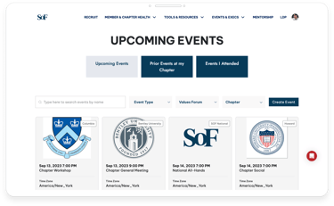
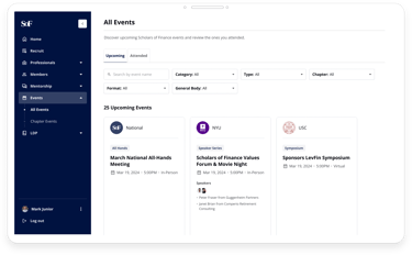
Events
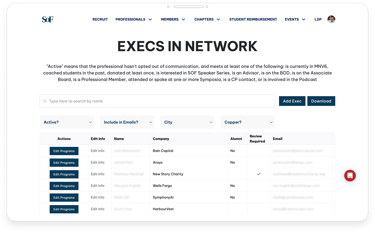
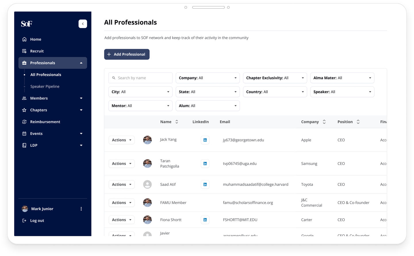
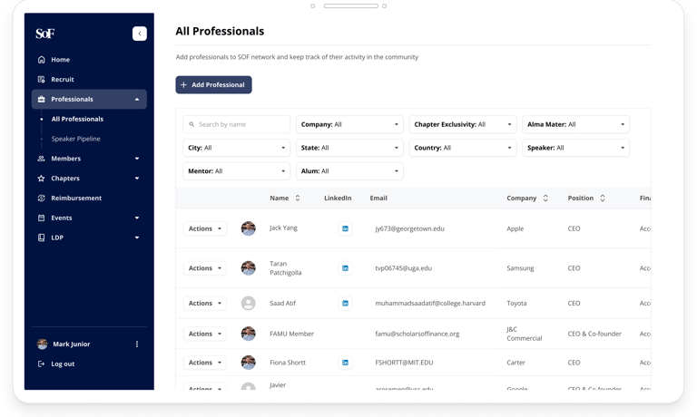
Professionals Network
Profile
Contact
Let's chat!
renatadutrams@gmail.com
+55 31 98892-3431
© 2025. All rights reserved.